Custom Wedding Crest
April 15, 2020
April 15, 2020
April 15, 2020
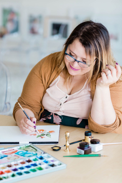
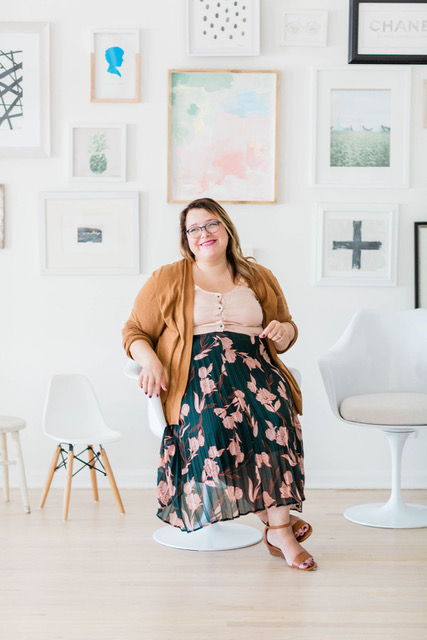
Hello OE followers! I’ve been itching to start sharing details about Phil and I’s wedding, and while I don’t want to share too much, a little inspiration won’t hurt, right? Well I’ve been working with one of the most fabulous artists/designers in Chicago for our custom wedding crest (& future stationery) and I’m mildly obsessed. First, meet Ashley, the madly talented creator behind Paper Love Club!
She’s designed wedding crests, brand logos and everything in between, so I was very aware of her style and I knew she would dominate our vision. Well, actually we didn’t have a vision. But I figured if Phil and I gave her enough chicken scratch ideas, she could somehow create our vision that we could use for the rest of our planning.
I think that was my favorite part of working with Ashley to design our crest. She continued asking us questions, re-designing current and new ideas until we couldn’t find one piece of imperfection in the crest. And now, we have a little piece of custom inspiration to share with our decor team and other vendors which puts us a step in the right direction.
We gave her our wedding “colors”, things we like to do together, and a little background about us. We also uploaded a handful of floral pictures to show the textures, percentages of greenery, and color complexion she should incorporate. It was a few week process because of the natural back and fourth/editing.
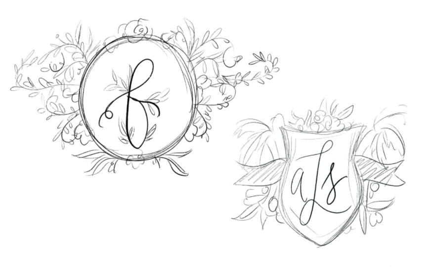
Here is a very shortened process of how she designed our crest! She started by providing us with many rough pencil sketches like the ones below. We commented on all the little things we liked and disliked, such as the shape, if there was a banner or not, the words in the middle, how the greenery looked (tame or wild), etc.
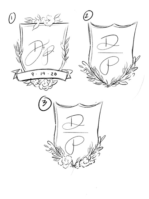
Next, she used our feedback to sketch more crest outlines to make sure we had the same overall vision, before adding in colors and tiny details. From the ones below, we liked the shape of #2 and #3 but the greenery/floral accents on #1. We were going back and fourth with a banner but ultimately decided against it. Now looking back, IF we put our date on the crest and had to postpone our date due to COVID-19, I’d be a little upset because this crest is going to be used through all of our stationery in the wedding.
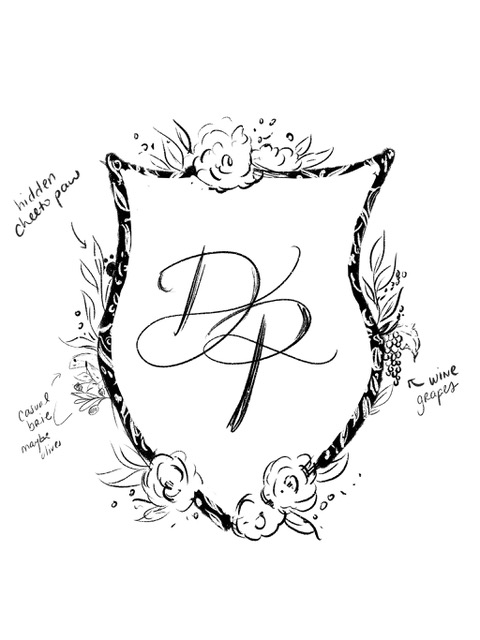
Now it’s time to add the “elements”! Like I mentioned before, we explained some of our common interests and hobbies. Naturally, Cheeto (our recently adopted kitty) had to be part of our crest because he’s a huge part of our life now. Besides that, we love cheese, wine, cooking, traveling, and our favorite place in the world is Barcelona and that’s where we fell in love with olives. Barcelona also has beautiful blue azulejo pattern artwork throughout the city so that is where the blue comes from. In the design below, you’ll see where she narrowed down our favorite outline and started adding our elements.
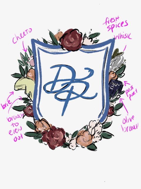
We asked Ashley to add a few more elements because we thought it was lacking something, but could not put our finger on it. She agreed to that but also said we should take it to the next step, which is adding color. I’m not going to lie, I think this is the part that Phil and I just sat on for a solid two weeks because we were busy with our work, but also we were not sure how to edit it down. We loved the color and overall idea but it was so hard to envision the final outcome that would be in watercolor. Our main feedback was the crest [below] was not “soft and delicate”. She must have thought we were crazy because she knew what it could become but we still did not. She said “heck, let’s take it to water color and go from there”.
I’m someone who loves design and I feel I have an artistic touch with things but when we came to designing a crest I felt absolutely lost. I loved and appreciated that Ashley never once got offended by our feedback and she really helped steer us in the right direction and ultimately designed the most beautiful crest I’ve ever seen – maybe I’m bias of course though 😉
Voilà! A masterpiece! To think that she hand painted every single element on here and brought it to digital astonishes me. There was a proof before this that did not have as many flowers/greenery, so we did a little adjusting before we got here but it was WELL worth the time.
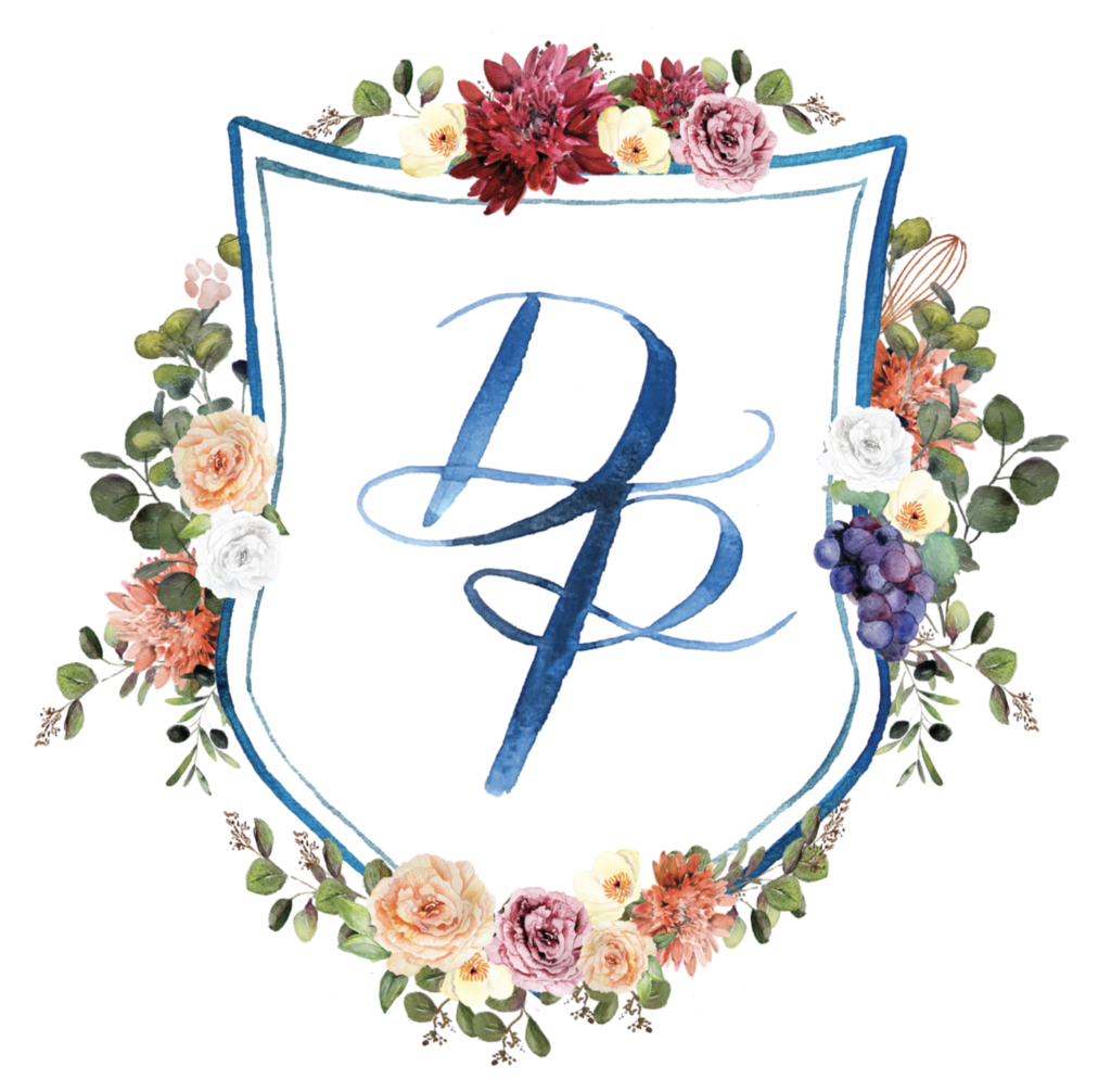
Elements to look for, starting clockwise on the top right: Whisk (for cooking), grapes (wine/travel), olive branches/blue inside coloring (Barcelona) and Cheeto paw print. Although we love cheese (haha), it did not seem appropriate to squeeze in, design wise (humph).
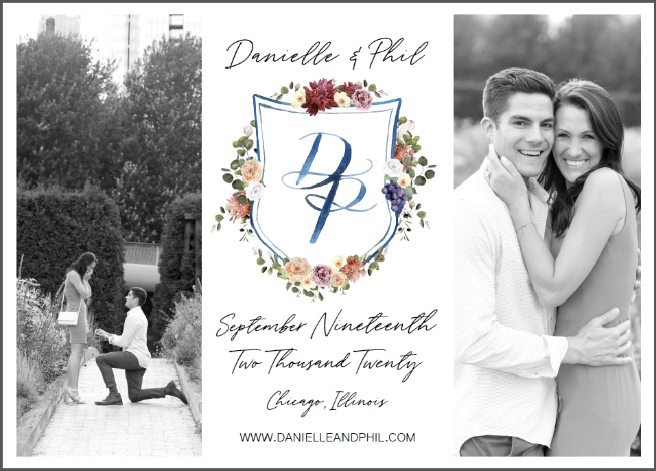
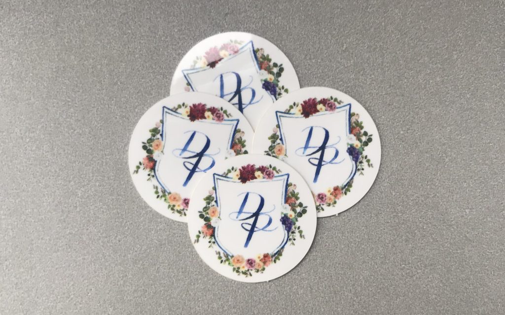
We already used this crest on our Save The Date and we also printed a few hundred 1″ stickers with the crest to seal envelopes (StickerApp). I’m not going to lie, they’re pretty dang cute. We will use this crest on a lot of our stationery as well. We’re obsessed with the blue tones (happens to be 2020 Pantone Color of the Year!) and we love the shades of warm, fall-color flowers.
I highly, highly recommend reaching out to Ashley if you want something custom designed for your wedding. You will not be disappointed! I’ll be sharing much more of her product down the road but that will most likely after the wedding, to save it as a surprise for our guests! Cheers!
Photos of Ashley: Photography by Lauryn
-Danielle, Ohana Events
© ohana events 2022 .
ALL RIGHTS RESERVED | SITE CREDIT.
CONTACT
BLOG
south florida
destination
midwest
HOME
dream big
let's
con
nect
Read
ABOUT
South Florida
Midwest
Destination
services
Events
BLOG
Get Inspired
Connect
INQUIRE
Contact Us
Chicago's Rental Collection
Meet The Team
